In this article, we’ll explore the process of migrating a stock visualization application from Streamlit to Gradio. We’ll dive into the implementation details, architectural decisions, and key differences between the two frameworks. By the end, you’ll comprehensively understand how to build interactive data visualization applications with Gradio.
Introduction
The Indian Stock Visualizer is a web application that allows users to analyze Indian stocks from NSE/BSE exchanges with interactive visualizations and detailed metrics. Originally built with Streamlit, but we decided to create a Gradio version to explore the differences between these two popular Python web frameworks.
Why Migrate from Streamlit to Gradio?
Both Streamlit and Gradio are excellent frameworks for building data applications, but they have different strengths:
- Streamlit excels at creating data-focused applications with a clean, linear flow and extensive widget support.
- Gradio shines in building interfaces for machine learning models and offers more flexibility in UI layout with its blocks API.
Our migration to Gradio was motivated by several factors:
- More flexible UI layouts with Gradio’s blocks API
- Tabbed interfaces that allow for more compact presentation of information
- Easier integration with machine learning models (for potential future features)
- Learning opportunity to compare both frameworks
Project Architecture
The Indian Stock Visualizer (Gradio version) maintains the same core functionality as the Streamlit version but with a different UI implementation. Let’s look at the high-level architecture:
indian-stock-visualizer-gradio/
├── app.py              # Main application file with Gradio interface
├── stock_database.py  # Stock database utilities for autocomplete
├── requirements.txt   # Project dependencies
└── README.md          # Project documentation
The application follows a modular design with a clear separation of concerns:
- Data Retrieval Layer: Functions to fetch stock data from Yahoo Finance
- Data Processing Layer: Functions to calculate technical indicators and metrics
- Visualization Layer: Functions to create interactive Plotly charts
- UI Layer: Gradio components to build the user interface
Key Components
1. Stock Data Retrieval
The application uses the yfinance library to fetch stock data from Yahoo Finance. Here’s how we retrieve stock data:
def get_stock_data(ticker, period="6mo", interval="1d"):
    """Fetch stock data from Yahoo Finance"""
    try:
        stock = yf.Ticker(ticker)
        data = stock.history(period=period, interval=interval)

        # Get company info
        info = stock.info

        # Create summary metrics
        metrics = {
            'Current Price': info.get('currentPrice', info.get('regularMarketPrice', 'N/A')),
            'Market Cap': info.get('marketCap', 'N/A'),
            # ... other metrics
        }

        return {
            'history': data,
            'metrics': metrics,
            'info': info
        }
    except Exception as e:
        raise Exception(f"Error fetching data: {str(e)}")
This function returns a dictionary containing historical price data, company information, and key financial metrics.
2. Technical Indicators
The application calculates several technical indicators to help users analyze stocks:
def calculate_technical_indicators(df):
    """Calculate technical indicators for the stock data"""
    if df.empty:
        return df

    # Moving Averages
    df['MA20'] = df['Close'].rolling(window=20).mean()
    df['MA50'] = df['Close'].rolling(window=50).mean()
    df['MA200'] = df['Close'].rolling(window=200).mean()

    # Bollinger Bands
    df['Upper_Band'] = df['MA20'] + (df['Close'].rolling(window=20).std() * 2)
    df['Lower_Band'] = df['MA20'] - (df['Close'].rolling(window=20).std() * 2)

    # RSI (Relative Strength Index)
    delta = df['Close'].diff()
    gain = delta.where(delta > 0, 0).rolling(window=14).mean()
    loss = -delta.where(delta < 0, 0).rolling(window=14).mean()
    rs = gain / loss
    df['RSI'] = 100 - (100 / (1 + rs))

    # MACD (Moving Average Convergence Divergence)
    df['EMA12'] = df['Close'].ewm(span=12, adjust=False).mean()
    df['EMA26'] = df['Close'].ewm(span=26, adjust=False).mean()
    df['MACD'] = df['EMA12'] - df['EMA26']
    df['Signal_Line'] = df['MACD'].ewm(span=9, adjust=False).mean()
    df['MACD_Histogram'] = df['MACD'] - df['Signal_Line']

    return df
This function calculates:
- Moving averages (20, 50, and 200-day)
- Bollinger Bands
- Relative Strength Index (RSI)
- Moving Average Convergence Divergence (MACD)
3. Data Visualization with Plotly
We use Plotly to create interactive charts for stock analysis. Here’s an example of how we create a candlestick chart:
# Create price chart
price_fig = go.Figure()
price_fig.add_trace(go.Candlestick(
    x=df.index,
    open=df['Open'],
    high=df['High'],
    low=df['Low'],
    close=df['Close'],
    name='OHLC'
))
price_fig.update_layout(
    title=f"{stock_name} Stock Price",
    yaxis_title='Stock Price (₹)',
    xaxis_title='Date',
    template='plotly_white',
    height=500
)
Plotly provides rich interactive features like zooming, panning, and tooltips that enhance the user experience.
4. Stock Database for Autocomplete
To provide a better user experience, we implemented a stock database that allows users to search for stocks by name or symbol:
def get_nse_stocks_list():
    """Returns a list of dictionaries, each containing stock symbol and company name."""
    nse_url = "https://nsearchives.nseindia.com/content/equities/EQUITY_L.csv"

    headers = {
        'User-Agent': 'Mozilla/5.0 (Windows NT 10.0; Win64; x64) AppleWebKit/537.36 (KHTML, like Gecko) Chrome/91.0.4472.124 Safari/537.36'
    }

    s = requests.Session()
    s.headers.update(headers)
    r = s.get(nse_url)
    s.close()

    df_nse = pd.read_csv(io.BytesIO(r.content))

    # Create a list of dictionaries for each stock
    stock_dict_list = []
    for index, row in df_nse.iterrows():
        stock_dict = {
            row['NAME OF COMPANY'] :row['SYMBOL']
        }
        stock_dict_list.append(stock_dict)

    return stock_dict_list
This function fetches the list of stocks from the NSE website and formats it for use in the application.
Building the Gradio Interface
Now, let’s look at how we built the Gradio interface. Gradio uses a blocks-based approach to UI construction, which gives us more flexibility in layout compared to Streamlit.
1. Creating the Basic Structure
with gr.Blocks(title="Indian Stock Data Visualizer", theme=gr.themes.Soft()) as app:
    gr.Markdown("# 📈 Indian Stock Data Visualizer")
    gr.Markdown("An interactive tool for analyzing Indian stocks from NSE/BSE")

    with gr.Row():
        with gr.Column(scale=1):
            # Settings panel
            gr.Markdown("### ⚙️ Settings")
            exchange = gr.Radio(label="Select Exchange:", choices=exchange_options, value="NSE")
            analysis_mode = gr.Radio(label="Analysis Mode:", choices=analysis_mode_options, value="Single Stock Analysis")
            period = gr.Dropdown(label="Select Time Period:", choices=list(time_options.keys()), value="1 Year")
            interval = gr.Dropdown(label="Select Interval:", choices=list(interval_options.keys()), value="Daily")

            # Stock selection components
            with gr.Group(visible=True) as single_stock_group:
                single_stock = gr.Dropdown(label="Select a Stock:", choices=list(sorted_stock_options.keys()))

            with gr.Group(visible=False) as multi_stock_group:
                multi_stock = gr.Dropdown(label="Select Stocks to Compare:", choices=list(sorted_stock_options.keys()), multiselect=True)

            # Analysis button
            analyze_button = gr.Button("Analyze Stock(s)")

        # Results area
        with gr.Column(scale=3):
            # Output components...
This creates a two-column layout with settings on the left and results on the right.
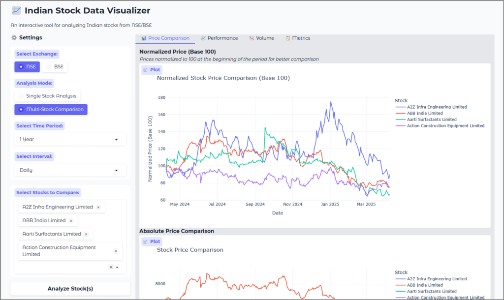
2. Implementing Tabbed Interfaces
One of the advantages of Gradio is the ability to create tabbed interfaces, which helps organize content in a more compact way:
with gr.Tabs():
    with gr.TabItem("📊 Price Chart"):
        price_chart = gr.Plot()

    with gr.TabItem("📈 Technical Indicators"):
        ma_chart = gr.Plot()
        bb_chart = gr.Plot()
        rsi_chart = gr.Plot()
        macd_chart = gr.Plot()

    with gr.TabItem("📉 Volume"):
        volume_chart = gr.Plot()

    with gr.TabItem("📋 Financial Data"):
        metrics_table = gr.HTML()
        # ... other components
This creates a tabbed interface that allows users to switch between different views of the data.
3. Dynamic UI Updates
Gradio allows us to dynamically update the UI based on user interactions. For example, we toggle between single stock and multi-stock analysis modes:
# Function to toggle visibility of stock selection groups
def toggle_stock_selection(mode):
    if mode == "Single Stock Analysis":
        return gr.update(visible=True), gr.update(visible=False)
    else:
        return gr.update(visible=False), gr.update(visible=True)

# Connect the analysis mode radio button to the toggle function
analysis_mode.change(toggle_stock_selection, inputs=analysis_mode, outputs=[single_stock_group, multi_stock_group])
This function updates the visibility of UI components based on the selected analysis mode.
4. Handling User Interactions
When the user clicks the “Analyze Stock(s)” button, we run the appropriate analysis function and update the UI with the results:
# Connect the analyze button to the run_analysis function
analyze_button.click(
    run_analysis,
    inputs=[analysis_mode, exchange, period, interval, single_stock, multi_stock],
    outputs=[
        error_box,
        company_name, company_overview, current_price, market_cap, pe_ratio, dividend_yield,
        valuation, price_chart, ma_chart, bb_chart, rsi_chart, macd_chart, volume_chart,
        metrics_table, dividends, splits, download_data,
        norm_price_chart, multi_price_chart, returns_table, returns_chart, volatility_chart,
        multi_volume_chart, avg_volume_chart, metrics_comparison, multi_download_data
    ]
)
This connects the button-click event to the run_analysis function, which processes the user’s inputs and updates the output components.
Key Differences Between Streamlit and Gradio Implementations
1. UI Structure and Layout
Streamlit:
- Linear flow with widgets on the sidebar
- Automatic reactivity (the app reruns when inputs change)
- Simple API with less boilerplate code
Gradio:
- Blocks-based layout with more control over component placement
- Event-based reactivity (explicit connections between inputs and outputs)
- More verbose API but greater flexibility
2. Component Organization
Streamlit:
# Streamlit sidebar for inputs
with st.sidebar:
    exchange = st.radio("Select Exchange:", ["NSE", "BSE"])
    analysis_mode = st.radio("Analysis Mode:", ["Single Stock Analysis", "Multi-Stock Comparison"])

# Main area for outputs
st.title("📈 Indian Stock Data Visualizer")Gradio:
# Gradio blocks for layout
with gr.Blocks() as app:
    with gr.Row():
        with gr.Column(scale=1):
            exchange = gr.Radio(label="Select Exchange:", choices=["NSE", "BSE"], value="NSE")
        with gr.Column(scale=3):
            gr.Markdown("# 📈 Indian Stock Data Visualizer")
3. State Management
Streamlit:
- Session state for persistent variables
- Automatic caching of expensive computations
Gradio:
- Explicit state management through function inputs and outputs
- Manual caching implementation required
4. Event Handling
Streamlit:
- Implicit event handling through automatic reruns
- Button callbacks for specific actions
Gradio:
- Explicit event connections between components
- More granular control over when functions run
Performance Considerations
Both frameworks have different performance characteristics:
- Initial Load Time: Gradio typically has a faster initial load time compared to Streamlit.
- Reactivity: Streamlit’s automatic reactivity can lead to unnecessary reruns, while Gradio’s event-based approach only updates what’s needed.
- Memory Usage: Gradio tends to be more memory-efficient for complex applications with many components.
- Scaling: Both frameworks are designed for small to medium-sized applications and may require additional infrastructure for production-scale deployments.
Error Handling
Proper error handling is crucial for a good user experience. In our Gradio implementation, we use a dedicated error box component:
# Error message box
error_box = gr.Textbox(label="Error", visible=False)

# In the run_analysis function
try:
    # Analysis code...
except Exception as e:
    return {error_box: gr.update(value=f"An error occurred: {str(e)}", visible=True)}
This approach allows us to display clear error messages to the user when something goes wrong.
Data Export Functionality
We implemented data export functionality to allow users to download historical stock data:
# Create a temporary file for download
import tempfile
temp_file = tempfile.NamedTemporaryFile(delete=False, suffix=".csv")
with open(temp_file.name, "w") as f:
    f.write(result["historical_data"])

# Add the file to the outputs
download_data = gr.File(label="Download Historical Data")
This creates a downloadable CSV file containing the historical stock data.
Conclusion
Migrating from Streamlit to Gradio provided valuable insights into the strengths and weaknesses of both frameworks. While Streamlit offers a simpler API and automatic reactivity, Gradio provides more flexibility in UI layout and event handling.
The Indian Stock Visualizer demonstrates how to build a complex data visualization application with Gradio, including:
- Fetching and processing financial data
- Calculating technical indicators
- Creating interactive visualizations
- Building a flexible and responsive UI
Both frameworks are excellent choices for building data applications, and the choice between them depends on your specific requirements and preferences.
Github link: https://github.com/sethlahaul/indian-stock-visualizer-gradio
Future Enhancements
Some potential enhancements for the Indian Stock Visualizer include:
- Portfolio Tracking: Allow users to create and track virtual portfolios
- Alerts and Notifications: Implement price alerts and notifications
- Machine Learning Integration: Add predictive analytics using machine learning models
- Fundamental Analysis: Include more detailed fundamental analysis metrics
- Mobile Optimization: Improve the mobile user experience
By understanding the implementation details and architectural decisions behind the Indian Stock Visualizer, you can apply similar patterns to your own data visualization projects, whether you choose to use Streamlit, Gradio, or another framework.
