The Power Utility Monitoring Dashboard is a Streamlit-based web application designed to visualize, analyze, and monitor electricity consumption, costs, and appliance-level breakdowns. This guide details the implementation, design decisions, and customization tips for the dashboard.
Features Overview
- Real-time and historical electricity consumption monitoring
- Cost analysis and projections
- Appliance-level consumption breakdown
- Anomaly detection for unusual usage patterns
- Customizable date ranges and aggregation levels
- Interactive visualizations with Plotly
1. Data Generation
Synthetic Data Creation
Since real utility data may not be available for demo purposes, the dashboard generates synthetic data:
- Hourly timestamps for the past year
- Consumption (kWh) with daily and seasonal patterns
- Voltage, current, and power factor with realistic noise
- Dynamic price per kWh with seasonal variation
- Random peaks to simulate anomalies
- Appliance-level breakdown (HVAC, Lighting, Kitchen, Electronics, Water Heating, Other)
Key Function:
@st.cache_data
def generate_sample_data():
    # ...
    return df, appliance_df
2. Data Filtering and Aggregation
Date Range Selection
Users can select predefined or custom date ranges via the sidebar. Data is filtered accordingly.
Aggregation Levels
Data can be aggregated by Hourly, Daily, Weekly, or Monthly intervals using Pandas’ resample method.
Aggregation Function:
def aggregate_data(df, agg_level):
    if agg_level == "Hourly":
        return df.set_index('timestamp').resample('h').mean(numeric_only=True)
    # ...
3. Streamlit UI Structure
Layout
- Wide layout for optimal dashboard experience
- Custom CSS for a modern look and feel
- Sidebar controls for date range, aggregation, and comparison
- Tabs for Overview, Consumption Analysis, Cost Analysis, and Appliance Breakdown
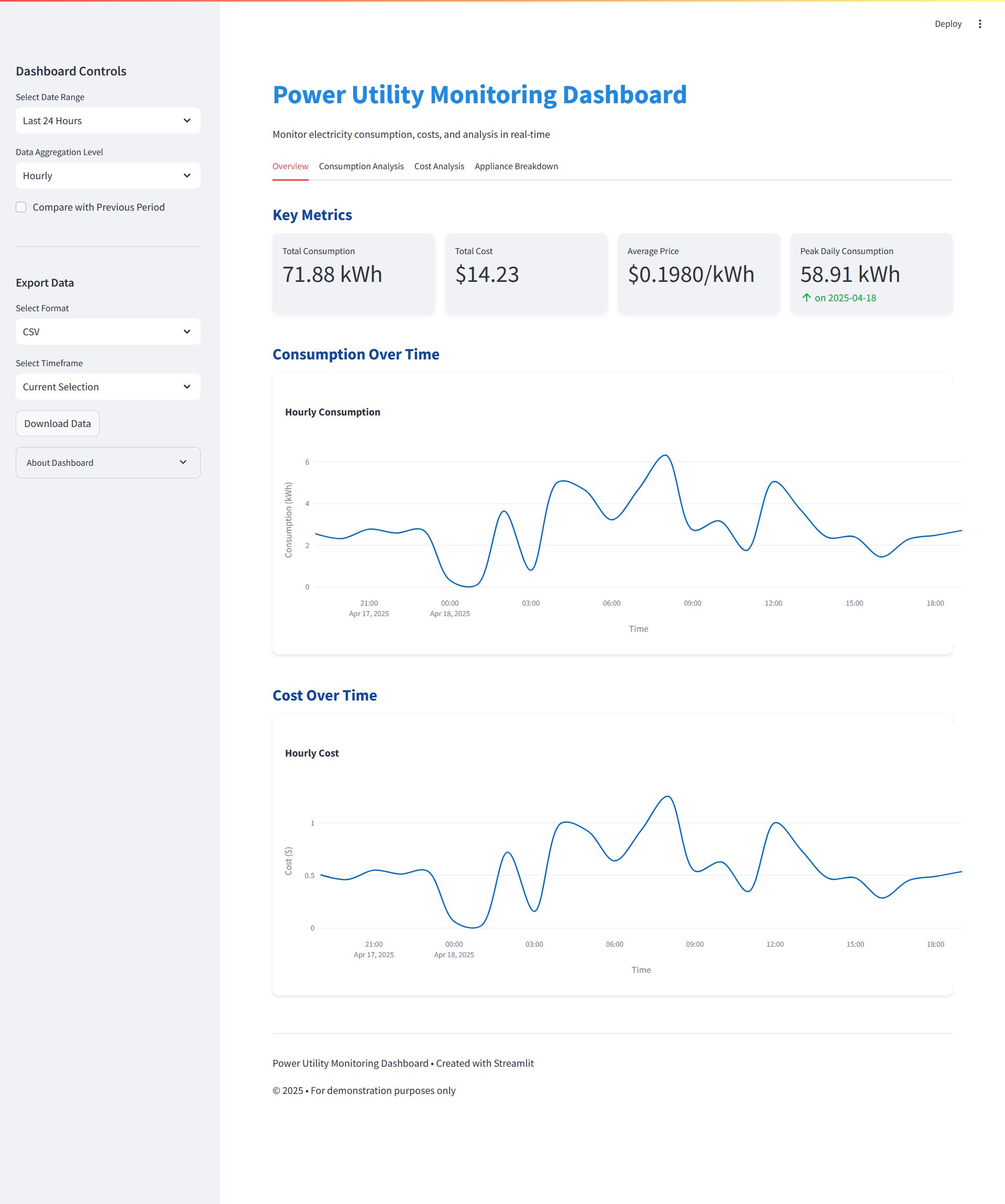
Key Metrics
Displayed at the top of the Overview tab using st.metric:
- Total Consumption
- Total Cost
- Average Price
- Peak Daily Consumption
Visualizations
- Line charts for consumption and cost over time
- Bar charts for hourly, daily, and monthly patterns
- Heatmap for day vs. hour consumption
- Scatter and trendline for cost analysis
- Pie chart for appliance breakdown
- Anomaly detection with highlighted outliers
4. Anomaly Detection
Anomalies are consumption values more than 3 standard deviations from a 24-hour rolling mean. These are visualized and optionally listed in a table.
5. Cost Analysis and Projections
- Daily cost breakdown
- Price trends
- Unit cost vs. consumption
- Projected costs for future periods based on recent averages
- Optimization suggestions based on peak hours and appliance usage
6. Appliance Breakdown
A pie chart shows the share of each appliance category in total consumption for the selected period.
7. Customization Tips
- Replace synthetic data with real utility data by modifying
generate_sample_data() - Add more appliances or metrics as needed
- Integrate with databases or APIs for live data
- Enhance anomaly detection with advanced ML models
8. Running the Dashboard
- Install dependencies:
pip install -r requirements.txt
- Run the app:
streamlit run app.py
- Open the provided local URL in your browser.
9. File Structure
app.py— Main Streamlit dashboard coderequirements.txt— Python dependenciesBLOG.md— This documentation
10. Requirements
See requirements.txt for all necessary packages.
Conclusion
This dashboard provides a robust foundation for power utility monitoring and can be extended for real-world applications. Feel free to fork the repository or open an issue for questions or contributions.