A comprehensive guide to creating an enterprise-grade manufacturing analytics platform using Streamlit and Python
Introduction
In today’s data-driven manufacturing landscape, real-time visibility into production operations isn’t just a luxury—it’s a necessity. Factory managers need instant access to key performance indicators, equipment effectiveness metrics, and quality control data to make informed decisions that impact productivity, profitability, and operational excellence.
This article explores the design philosophy, technical architecture, and implementation details behind a comprehensive automotive factory dashboard that transforms raw production data into actionable insights. You can check out the app here – https://automotive-factory-visualizer.streamlit.app/
Design Philosophy
1. Information Hierarchy and Progressive Disclosure
The dashboard follows a deliberate information architecture that guides users from high-level overview to detailed analysis:
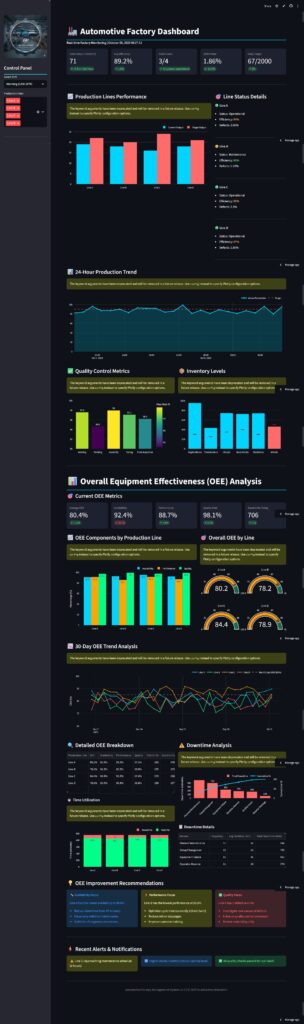
Level 1: At-a-Glance Metrics
- Five critical KPIs displayed prominently at the top
- Color-coded delta indicators showing trends
- Instant understanding of overall factory health
Level 2: Departmental Views
- Production line performance
- Quality control metrics
- Inventory status
- Each section tells a specific operational story
Level 3: Deep Dive Analysis
- Comprehensive OEE section with multiple visualizations
- Historical trends and patterns
- Root cause analysis tools
This hierarchical approach prevents cognitive overload while ensuring that users can drill down when needed.
2. Dark Theme and Visual Contrast
The dashboard employs a dark theme (#0e1117 background) for several strategic reasons:
- Reduced Eye Strain: Dark interfaces are easier on the eyes during extended monitoring sessions, especially in control room environments
- Enhanced Data Visualization: Charts and graphs “pop” against dark backgrounds, making data patterns more visible
- Modern Aesthetic: Aligns with contemporary UI trends and professional software expectations
- Energy Efficiency: Lower power consumption on OLED displays common in modern facilities
The accent color (#00d4ff – cyan blue) provides:
- High contrast for critical information
- Association with technology and precision
- Clear visual hierarchy without overwhelming the interface
3. Real-Time Data Philosophy
The dashboard simulates real-time data updates using a 2-second TTL (Time-To-Live) cache:
@st.cache_data(ttl=2)
def generate_production_data():
    # Data generation logic
This approach balances:
- Responsiveness: Fresh data every 2 seconds
- Performance: Cached results prevent unnecessary recomputation
- User Experience: Smooth updates without jarring reloads
In production environments, this would connect to actual data streams from:
- SCADA systems
- MES (Manufacturing Execution Systems)
- IoT sensors on production equipment
- ERP systems for inventory data
Technical Architecture
Component Structure
1. Data Generation Layer
Each data function serves a specific analytical purpose:
Production Metrics
generate_production_data()
- Current output per line
- Target comparisons
- Efficiency calculations
- Status monitoring
OEE Calculations
generate_oee_data()
- Availability = (Runtime / Planned Time)
- Performance = (Actual Output / Ideal Output)
- Quality = (Good Units / Total Units)
- OEE = Availability × Performance × Quality
Historical Trends
generate_hourly_production()
generate_oee_history()
- Time-series data for pattern recognition
- Trend analysis capabilities
- Predictive maintenance indicators
2. Visualization Strategy
The dashboard leverages Plotly for all visualizations, chosen for:
- Interactivity: Hover tooltips, zoom, pan capabilities
- Customization: Full control over styling and themes
- Performance: Efficient rendering of complex charts
- Responsiveness: Automatic resizing and mobile compatibility
Chart Selection Rationale:
| Data Type | Visualization | Rationale |
|---|---|---|
| Current vs Target | Grouped Bar Chart | Direct comparison, easy to interpret gaps |
| Time Series | Line Chart with Fill | Shows trends and volatility patterns |
| OEE Components | Grouped Bar Chart | Compares three metrics simultaneously |
| Overall OEE | Gauge Charts | Intuitive representation with thresholds |
| Downtime Analysis | Pareto Chart | Identifies critical issues (80/20 rule) |
| Quality Metrics | Colored Bar Chart | Heat map effect highlights problem areas |
3. Layout Architecture
The dashboard uses Streamlit’s column system strategically:
col1, col2, col3, col4, col5 = st.columns(5)
Five-Column Layout (Metrics): Equal weight for primary KPIs
col1, col2 = st.columns([2, 1])
2:1 Ratio: Main visualization gets more space, details sidebar
col1, col2 = st.columns(2)
Equal Split: Side-by-side comparisons of related metrics
This flexible grid system ensures:
- Responsive design across screen sizes
- Logical information grouping
- Efficient use of screen real estate
OEE Section: A Case Study in Dashboard Design
The Overall Equipment Effectiveness (OEE) section exemplifies best practices in industrial analytics dashboards.
Why OEE Matters
OEE is the gold standard for measuring manufacturing productivity. It combines three critical factors:
- Availability: Are machines running when they should be?
- Performance: Are they running at optimal speed?
- Quality: Are they producing good parts?
An OEE of 85% is considered “world-class” manufacturing. Most factories operate between 60-75%.
Design Decisions
Multi-Dimensional Visualization
Rather than showing a single OEE number, we present:
Component Breakdown
- Grouped bar charts show which factor (A, P, or Q) is the bottleneck
- Immediate identification of improvement opportunities
- Line-by-line comparison reveals inconsistencies
Gauge Indicators
- Four separate gauges provide quick health checks
- Color zones (red/orange/green) eliminate ambiguity
- Threshold line at 85% benchmarks against industry standards
Historical Trends
- 30-day rolling view shows patterns
- Multiple lines enable cross-comparison
- Benchmark overlay contextualizes performance
Actionable Intelligence
The dashboard doesn’t just report data—it drives action:
Automated Recommendations
worst_availability = oee_data.loc[oee_data['Availability'].idxmin()]
The system identifies the weakest link and suggests specific interventions:
- Predictive maintenance for availability issues
- Process optimization for performance gaps
- Quality control enhancements for defect problems
Downtime Pareto Analysis
The Pareto chart implementation follows the 80/20 rule:
- Identifies the top causes of downtime
- Cumulative percentage line shows concentration
- Prioritizes improvement efforts where they’ll have maximum impact
User Experience Considerations
1. Sidebar Control Panel
The sidebar serves as the dashboard’s command center:
Contextual Controls
- Shift selection for time-based filtering
- Production line multi-select for focused analysis
- Date range pickers (easily extensible)
Quick Actions
- Refresh data manually (beyond automatic updates)
- Emergency stop button (would integrate with safety systems)
- Report generation trigger
System Status
- Connection status indicator
- Last update timestamp
- Version information
This separation keeps controls accessible without cluttering the main analytical area.
2. Color Psychology
Colors are chosen deliberately:
- Cyan (#00d4ff): Technology, precision, trust
- Green (#00ff88): Success, optimal performance
- Orange (#ffa500): Warning, attention needed
- Red (#ff6b6b): Critical issues, immediate action
Consistent color mapping across visualizations creates cognitive shortcuts—users instantly understand what’s good, warning, or critical.
3. Typography and Readability
The design prioritizes legibility:
- Sans-serif fonts for digital displays
- 14px minimum for body text
- 28px for primary metrics (scannable from distance)
- Adequate spacing prevents crowding
Control room displays often viewed from 6-10 feet away influenced these sizing decisions.
4. Responsive Data Tables
Rather than dumping raw data, tables are:
- Formatted with appropriate precision (1 decimal for percentages)
- Height-constrained to prevent scrolling fatigue
- Styled to match the overall theme
- Hidden indices reduce visual clutter
Performance Optimization
Caching Strategy
@st.cache_data(ttl=2)
Streamlit’s caching mechanism is crucial for dashboard performance:
Benefits:
- Reduces computation on every widget interaction
- Maintains responsiveness with large datasets
- Balances freshness with efficiency
TTL Selection:
- 2 seconds for rapidly changing production data
- Could vary by data type (5s for inventory, 1s for critical alerts)
Data Generation vs. Database Queries
The current implementation uses synthetic data:
np.random.randint(15, 25, 4)
In production, replace with:
def fetch_production_data(connection):
    query = """
        SELECT line_id, current_output, efficiency
        FROM production_metrics
        WHERE timestamp > NOW() - INTERVAL '5 minutes'
    """
    return pd.read_sql(query, connection)
Database Optimization Tips:
- Indexed timestamp columns for fast range queries
- Materialized views for complex OEE calculations
- Connection pooling to minimize overhead
- Async queries where Streamlit supports them
Extensibility and Future Enhancements
Phase 2 Features
Predictive Analytics
- Machine learning models for failure prediction
- Demand forecasting
- Optimal scheduling recommendations
Alerting System
- Email/SMS notifications for critical events
- Configurable threshold rules
- Escalation workflows
Multi-Factory Support
- Facility selector
- Cross-site comparisons
- Consolidated reporting
Export and Reporting
- PDF report generation
- Excel exports with formatting
- Automated daily/weekly summaries
Technical Debt Considerations
Current Limitations:
- No Authentication: Add user roles and permissions
- Browser Storage: Move to proper backend database
- Static Thresholds: Make configurable per line/product
- Limited Historical Data: Implement data warehouse
Scalability Path:
Current: Streamlit + In-Memory Data
↓
Phase 1: Streamlit + PostgreSQL
↓
Phase 2: Streamlit + TimescaleDB + Redis Cache
↓
Phase 3: Streamlit + Data Lake + Real-time Stream Processing
Implementation Best Practices
Code Organization
dashboard/
├── app.py                 # Main application
├── data/
│   ├── generators.py      # Data generation functions
│   └── queries.py         # Database queries
├── visualizations/
│   ├── charts.py          # Reusable chart components
│   └── themes.py          # Plotly themes
├── utils/
│   ├── calculations.py    # OEE and metric calculations
│   └── formatters.py      # Data formatting utilities
└── config/
    └── settings.py        # Configuration management
Testing Strategy
Unit Tests
- OEE calculation accuracy
- Data transformation functions
- Threshold logic
Integration Tests
- Database connectivity
- API endpoints (if applicable)
- Cache behavior
Visual Regression Tests
- Screenshot comparisons using Playwright
- Ensures UI consistency across updates
Deployment
Docker Container Approach
FROM python:3.11-slim

WORKDIR /app
COPY requirements.txt .
RUN pip install -r requirements.txt

COPY . .

EXPOSE 8501

CMD ["streamlit", "run", "app.py", "--server.address", "0.0.0.0"]
Environment Variables
DATABASE_URL=postgresql://user:pass@host:5432/factory_db
REFRESH_INTERVAL=2
ENABLE_ALERTS=true
Lessons Learned
What Worked Well
- Progressive Enhancement: Starting with a simple dashboard and adding complexity incrementally
- Stakeholder Feedback: Regular demos to factory managers shaped priorities
- Real Data Testing: Piloting with actual production data revealed edge cases
- Mobile Considerations: Even desktop-first dashboards need responsive layouts
Challenges and Solutions
Challenge: Too much information overwhelming users
Solution: Implemented tabbed interface (could extend current design)
Challenge: Color blindness accessibility
Solution: Added patterns/textures to visualizations, not just color
Challenge: Network latency in factory environments
Solution: Aggressive caching and local data buffering
Challenge: Different metrics matter to different roles
Solution: Role-based dashboard views (planned feature)
Conclusion
Building an effective manufacturing dashboard requires balancing multiple concerns – https://automotive-factory-visualizer.streamlit.app/:
- Technical Performance: Fast, reliable, scalable
- Visual Design: Clear, consistent, professional
- User Experience: Intuitive, actionable, appropriate
- Business Value: Insights that drive decisions
The automotive factory dashboard presented here demonstrates these principles through:
- Thoughtful information architecture
- Appropriate visualization selection
- Comprehensive OEE analysis
- Extensible technical foundation
Whether you’re building dashboards for manufacturing, logistics, healthcare, or any data-intensive domain, these design patterns and implementation strategies provide a solid foundation.
The key is remembering that a dashboard isn’t just about displaying data—it’s about enabling better decisions, faster.
Technical Specifications
Framework: Streamlit 1.28+
Visualization: Plotly 5.17+
Data Processing: Pandas 2.1+, NumPy 1.24+
Python Version: 3.11+
Performance Metrics:
- Initial load time: <2 seconds
- Update frequency: 2 seconds
- Data processing latency: <100ms
- Concurrent users supported: 50+ (with proper backend)
Resources and Further Reading
- Streamlit Documentation
- Plotly Graphing Library
- OEE Calculation Standards
- Manufacturing Analytics Best Practices
- Dashboard Design Patterns
Have you built similar dashboards? What design decisions worked for your use case? Share your experiences in the comments below.