Front end development has become more complex in the last few years. With the rise of complex UI, there is a much greater need to develop components independently. Modular development is now the preferred choice which is easier to maintain and scale. Modular development also provides the opportunity of reusing components which helps in faster turnaround time for development. Here are few React UI Frameworks that you can use to speed up your development.
#1. Material-UI
Material-UI provides React components for faster and easier web development of your React app. Material-UI is available as an npm package.
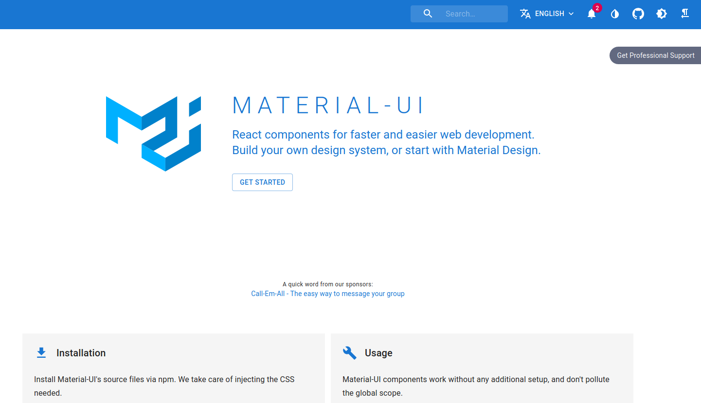
You can start using Material-UI with minimal Front-end infrastructure, which is great for prototyping.
Two Universal Module Definition (UMD) files are provided:
- one for development: https://unpkg.com/@material-ui/core@latest/umd/material-ui.development.js
- one for production: https://unpkg.com/@material-ui/core@latest/umd/material-ui.production.min.js
A set of reusable components for design tools is available, designed to match the React components, and to help you craft great products:
- Figma: A large UI kit with over 600 handcrafted Material-UI components.
- Sketch: A large UI kit with over 600 handcrafted Material-UI symbols.
- Adobe XD: A large UI kit with over 600 handcrafted Material-UI symbols.
- Framer: A small free UI kit of Material-UI components.
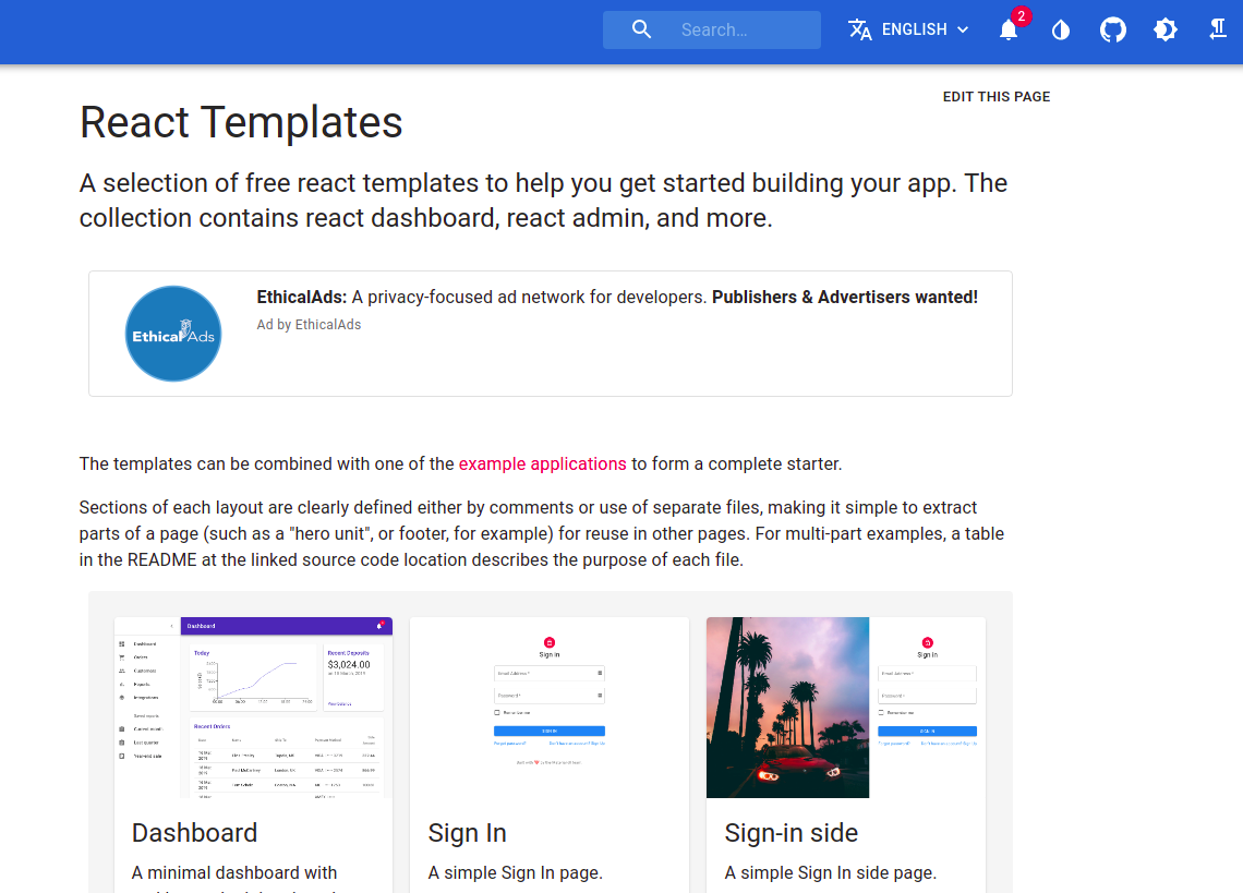
To quickly get started with your React app, you can also check out some of the free templates by Material-UI which includes react dashboard, react admin, simple sign in and sign out pages.
#2. Storybook
Storybook is an open source tool for developing UI components in isolation for React, Vue, Angular, and more. It makes building stunning UIs organized and efficient.
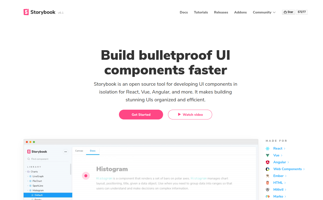
Storybook is a tool for UI development. It makes development faster and easier by isolating components. This allows you to work on one component at a time. You can develop entire UIs without needing to start up a complex dev stack, force certain data into your database, or navigate around your application.
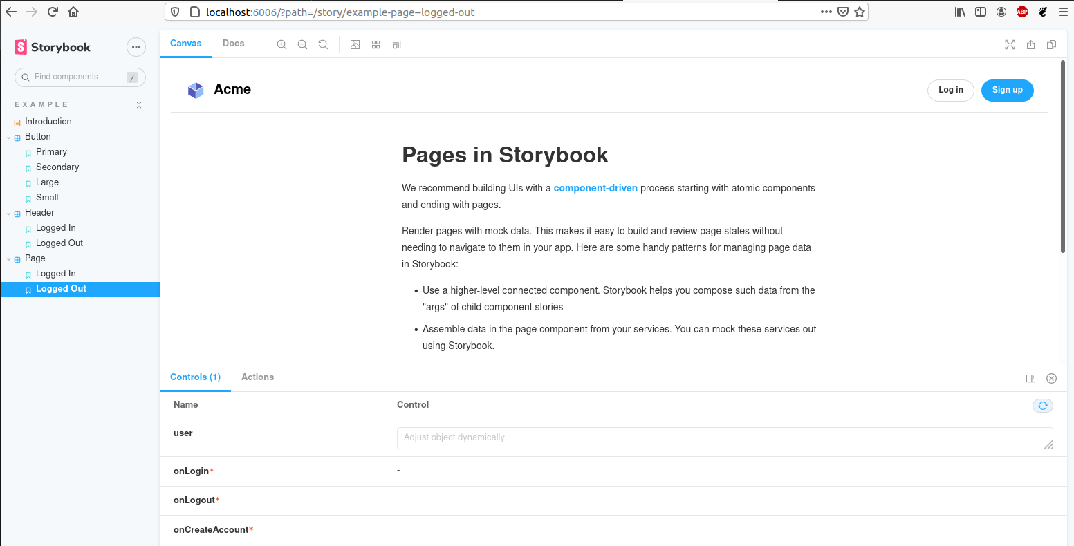
Storybook helps you document components for reuse and automatically visually test your components to prevent bugs. Extend Storybook with an ecosystem of addons that help you do things like fine tune responsive layouts or verify accessibility.
#3. Evergreen
Evergreen is a React UI Framework for building ambitious products on the web. Brought to you by Segment.
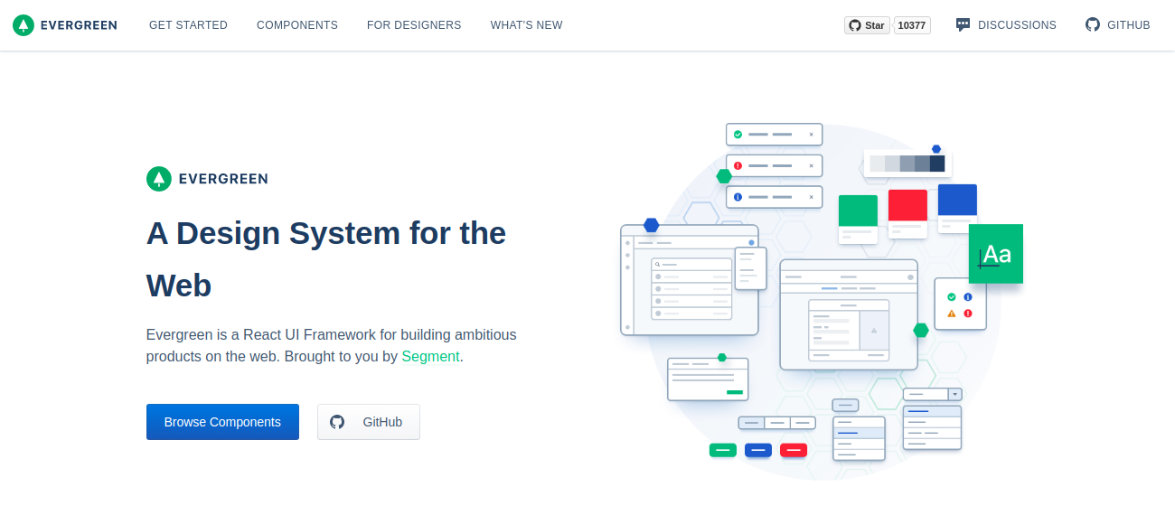
Check out some of the Evergreen React Components.

#4. React Bootstrap
React-Bootstrap replaces the Bootstrap JavaScript. Each component has been built from scratch as a true React component, without unneeded dependencies like jQuery.
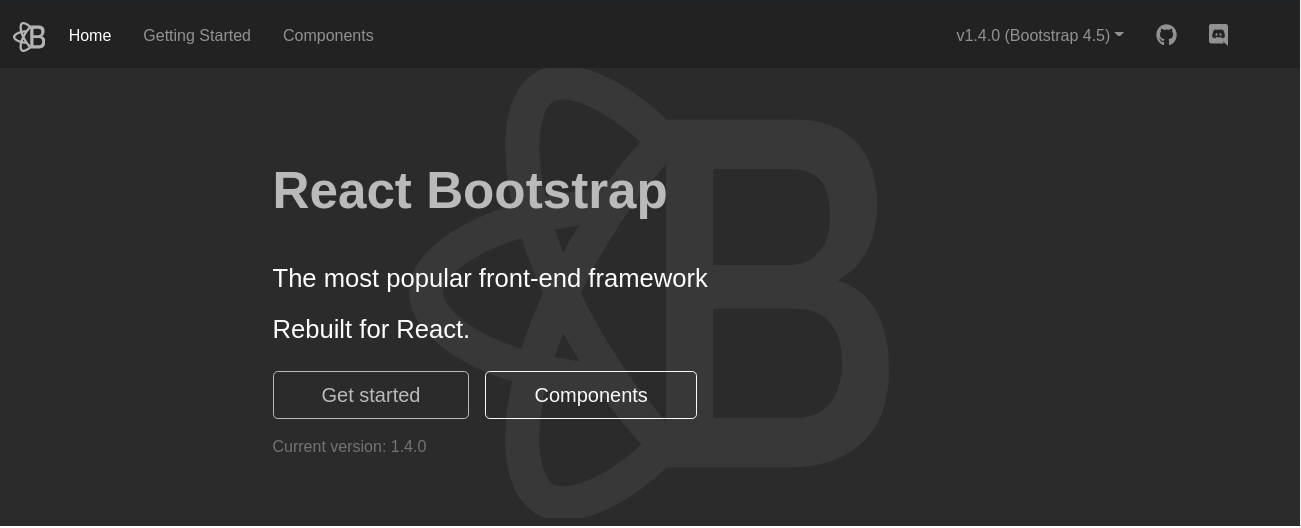
As one of the oldest React libraries, React-Bootstrap has evolved and grown alongside React, making it an excellent choice as your UI foundation.
Check out some of the React Bootstrap Components.

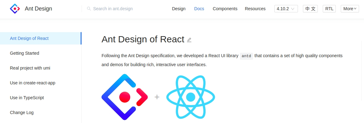
#5. Ant Design of React
Ant Design of React is a React UI library that contains a set of high quality components and demos for building rich, interactive user interfaces.
Some of the features are :
- Enterprise-class UI designed for web applications.
- A set of high-quality React components out of the box.
- Written in TypeScript with predictable static types.
- Whole package of design resources and development tools.
- Internationalization support for dozens of languages.
- Powerful theme customization in every detail.
So, that’s it for this article. Stay tuned for more.